If you want to learn about analytics, a fundamental skill is how to describe your data. Fortunately, analysts have standard metrics and methods they use to talk about their data. In this article, you’ll learn how to use descriptive statistics to talk about your data.
To help organize the material, I’ll divide the discussion into two parts: describing quantitative data, and describing qualitative data. Within each of these sections you’ll find an explanation of the most common metrics and methods used to characterize the data.
Describing Quantitative Data
When most people think about data analysis, they think about quantitative data. Quantitative data use numbers to represent their meaning.
For quantitative data, there are two primary ways to describe your data:
- Central Tendency: the value that a specific variable centers on or that a large portion of observations cluster around.
- Dispersion: a measure of how different, or spread out, the observations of a variable are from one another.
You can think of these as describing the two different dimensions of the shape of a distribution.
Describing the Shape of a Distribution
A histogram is a graph that illustrates the frequencies of different values across observations of a variable.
Analysts frequently talk about the shape of a variable’s distribution, which is a reference to the shape of the histogram for that variable.
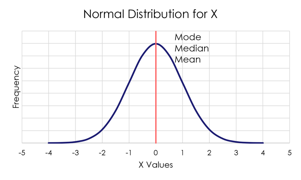
For example, many people are familiar with the bell curve, also known as a normal distribution.
Descriptive Measures of Central Tendency
Descriptive statistics of central tendency tell you about the value of a variable where observations tend to cluster.
There are three primary measures of central tendency for quantitative data:
- Mode: the most common value for a variable.
- Median: the value of a variable at which 50 percent of the observations are above, and 50 percent of the observations are below.
- Mean: the average value of all observations on a variable.
Importantly, if your variable is normally distributed then the mode, median, and mean will all be the same value, located at the center of the bell.
What if Your Data is Not Normal?
If your data is not a symmetrical bell curve, then analysts say the distribution is skewed.
A variable that is positively skewed, has a cluster of observations on the left side, and long right-hand tail.
A negatively skewed variable has a cluster on the right and a long left-hand tail.
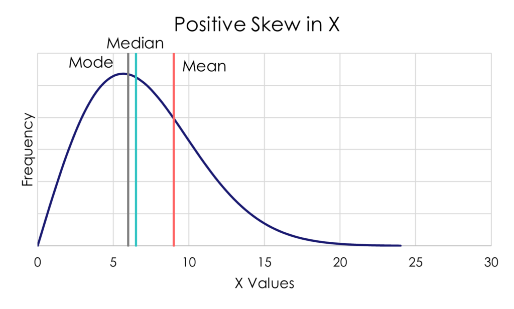
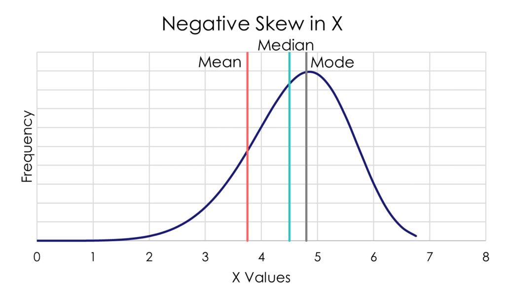
Figure 2. Positively and Negatively Skewed Distributions
In a skewed distribution, the modal value stays with the largest cluster of observations. The long tail pulls the median away from the model, and it pulls the mean even further away.
For this reason, when you have a skewed distribution, the median is often a more useful measure of central tendency than the median.
Caveats on Central Tendency
There are a few important caveats to know about measures of central tendency as well:
- A histogram for a variable can have more than one mode. Bimodal distributions will look like the two humps of a camel.
- The median of a variable does not have to be the value of any observation in the data set. If you have an even number of observations, the median will fall between the two in the middle.
- The mean is the only measure of central tendency that can be biased up or down by outliers – those observations with unusually high or low values for the variable.
Descriptive Measures of Dispersion
Descriptive statistics of dispersion capture the degree of variation from one observation to another in your data.
There are many different ways to describe dispersion, but we’ll focus on four primary metrics in this article.
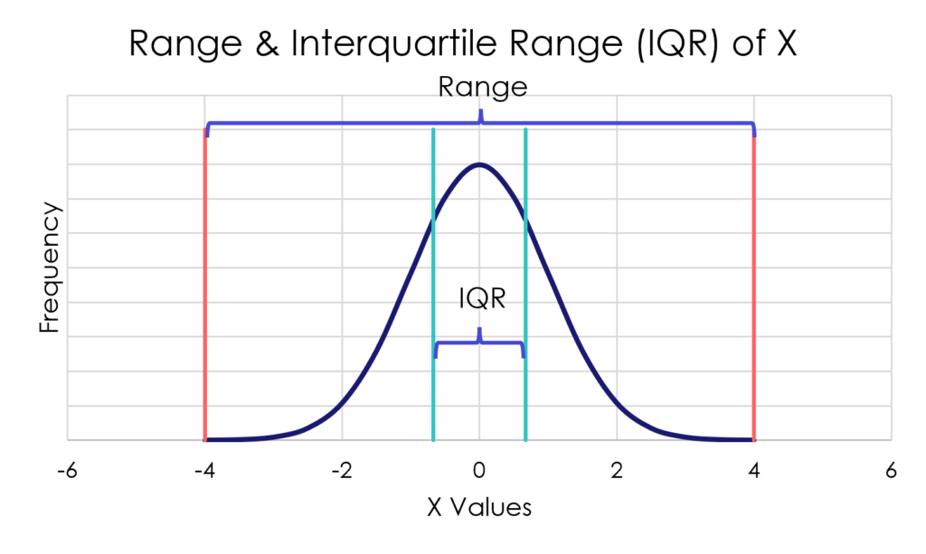
- Range: the difference between the highest and lowest values of a variable.
- Interquartile Range: the difference between the 75th percentile and 25th percentile values of a variable (excludes potential outliers)
- Variance: a measure of dispersion in which observations further from the mean of the distribution contribute more to dispersion than observations closer to the mean.
- Standard Deviation: the typical difference between any observation and the mean of the distribution. It’s not an average difference, but close.
Because the range can be influenced by outlier observations, the IQR only examines the spread of the middle 50 percent of the distribution (see Figure 3).
Without getting into the math behind it, Figure 4 illustrates how the variance captures the spread of data for a variable. On the left side of Figure 4, the original observations of a variable Y are shown. A horizontal reference line shows the mean of the data for Y. The vertical reference line show the difference between each observation and the average.
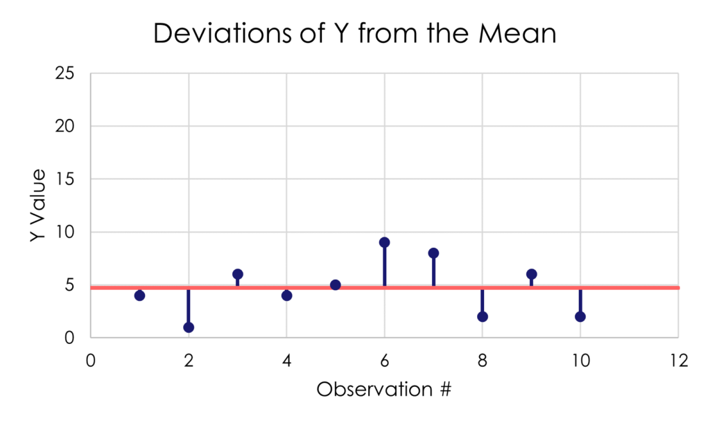
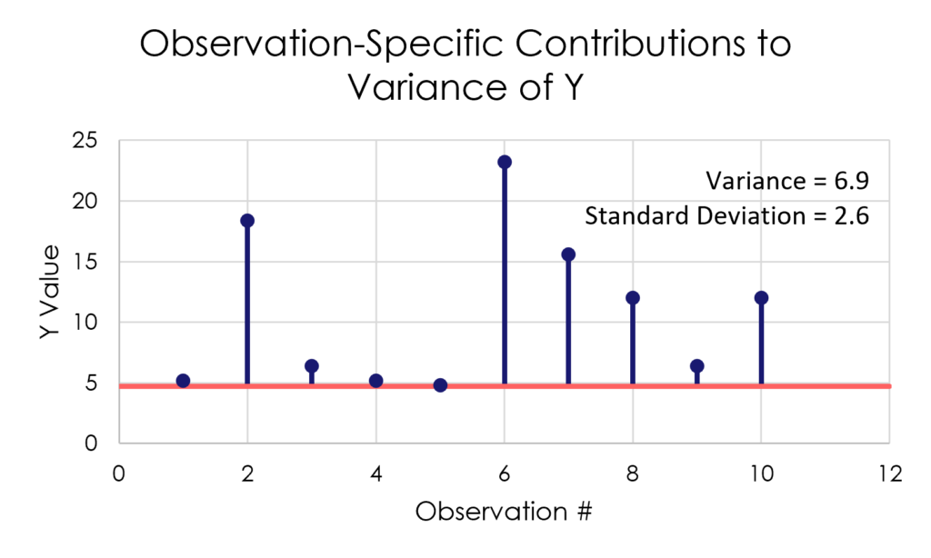
Figure 4. The Variance and Standard Deviation of a Variable Y
You might think that calculating the average deviation from the mean would be a pretty good idea for capturing variance. However, the average of the mean deviations is always zero (0). The positive values always cancel out the negative values. To get around this problem, the variance is calculated using squared deviations.
The calculation begins by multiplying each deviation by itself. This causes the observations farther from the mean to contribute more to the calculation of the variance as shown on the right side of Figure 4. For this variable, Y, the variance is 6.9.
The average of the squared deviations is a difficult way to think about the spread of values for a variable. Therefore, the standard deviation fixes this problem by presenting the square root of the variance.
This is why the square root is considered the “typical” difference of an observation from the mean. In this case, the standard deviation of Y is 2.6, which is the square root of 6.9.
Caveats on Dispersion
There are a few important caveats on descriptive measures of dispersion:
- If one measure of dispersion is zero (0), they all are. Your variable is a constant where all observations have the same value.
- Measures of dispersion cannot be negative values (i.e., less than zero).
- The range, variance, and standard deviation can all be influenced by outliers. Always know if outliers exist, and whether they have been included or excluded from the data.
Describing Qualitative Data
When most people think about statistical analysis, they are not thinking about qualitative data. Qualitative data often consist of collections of words, images, or sounds.
While there are many techniques for drawing meaning from qualitative data, they all begin with the same activity.
You begin describing qualitative data by reviewing the information and identifying ideas, concepts, or characteristics contained in your data.
As you are identifying concepts, avoid inserting your own interpretation of the data. You always want to understand the meaning and ideas that others attach to the data.
Reviewing and identifying concepts in your data is an iterative process.
You may review several interview transcripts before identifying a new concept. When this happens, you should re-review the previous transcripts to see if that concept is present and you simply have not become aware of it.
Once you have completed a review and coding of your data, then some analysts will calculate simple counts and percentages to better understand the data.
- How many (and what percentage of) data sources contained each concept?
- How often did a concept come up in a data source (e.g., how many times, or frequency per 100 words)?
Qualitative data analysis does not use the same statistical methods as quantitative analysis. Therefore, qualitative analysts typically do not talk about distributions and shapes of histograms. Rather, these analysts focus more on identifying how others perceive or experience situations and contexts.
Conclusion
Analysts use descriptive statistics to summarize data into easily digestible pieces of information. They use these statistics most often with quantitative data. Although analysts also use simple counts and percentages with qualitative data.
Descriptive statistics typically focus on two aspects of quantitative data: the values observations cluster around, and how spread-out observations are from one another.
As you spend more time thinking about your data, use these descriptive statistics to help make sense of the information. A good descriptive analysis can often help point you toward additional questions you want answers to.
